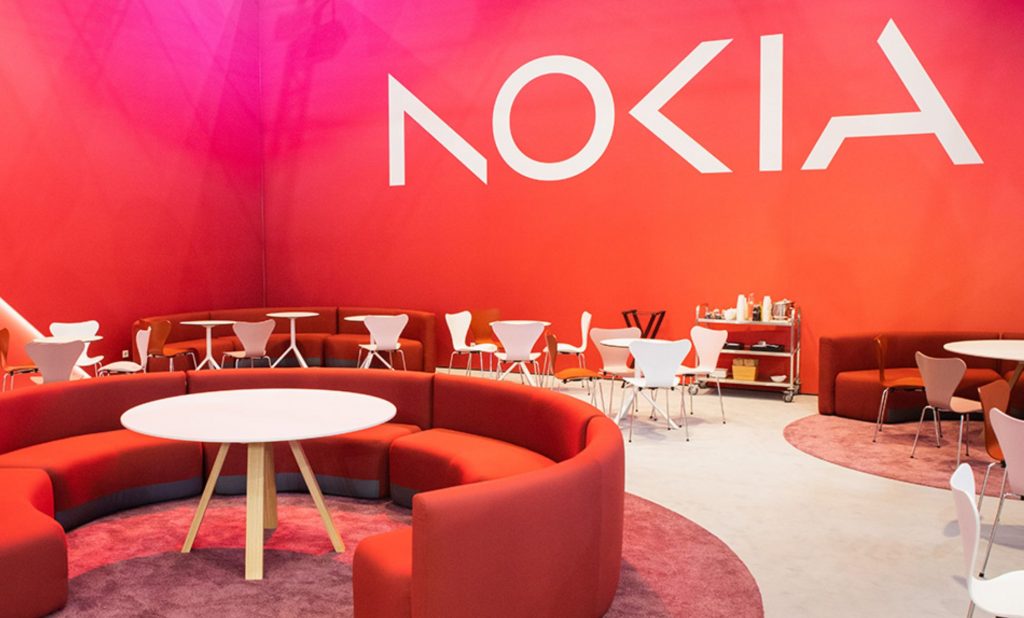
Nokia is changing its logo for the first time in nearly 60 years. It used to be the leader in the smartphone market. The company announced the dramatic new brand identity on Sunday, the day before Mobile World Congress Barcelona officially kicked off. Both the famous typeface and “Yale blue,” which was part of the old logo, have been taken away. Instead, the firm has gone for a style it says better reflects the company’s digital and modern sensibilities.
In a blog post written by Nokia CEO Pekka Lundmark, the company said it was changing its strategy and, as a key part of that, refreshing its brand to reflect who it is now: a leader in business-to-business technology innovation that is paving the way for the future where networks meet the cloud. “We are still seen as a successful mobile phone brand, but that is not Nokia,” Lundmark told Bloomberg. “Launching a new brand with an emphasis on networks and industrial digitalization will be very different from the traditional mobile phone market.”


Is this the final iteration of a logo that has meant so much to a lot of people? That’s not always the case. Since Microsoft’s disastrous $7 billion acquisition of Nokia’s Devices and Services division in 2014, Nokia’s phone business has not been a part of Nokia proper. HMD Global is a company made up of people who used to work for Nokia. When the tech giant broke its contract with Nokia in 2016, HMD Global bought the rights to use the Nokia brand on smartphones and tablets. Since then, HMD Global has been running on its own.
The G22, the company’s newest phone, was announced just yesterday, a day before today’s announcement, and it just so happens to sport the iconic Nokia logo. Engadget has gotten in touch with HMD Global to find out if they plan to stop using the logo.


