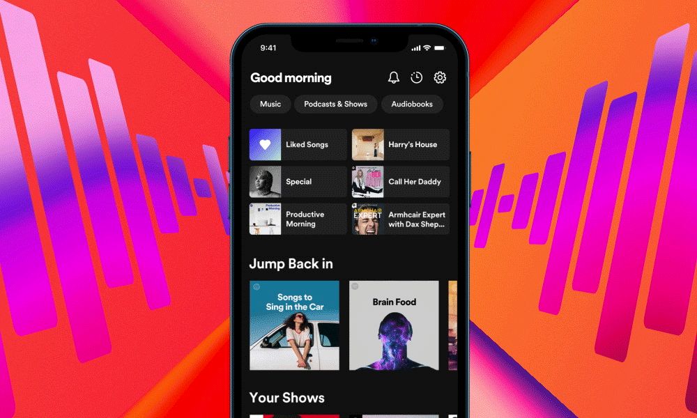
It is Spotify’s hope that this new iteration of the app’s central home screen will make it simpler for users to discover and explore new music and video. The new layout places an emphasis on visuals and vertical scrolling, making your home screen look less like a collection of album covers and more like a feed similar to TikTok and Instagram. It is Spotify’s hope that as you scroll, you will be able to easily find new content from all over the Spotify catalog.
At its Stream On event, Spotify unveiled a brand-new look that reflects the company’s aspirations for itself and its products. It has made significant investments in areas such as podcasting, audiobooks, live audio, and more in recent years in an effort to broaden its appeal beyond its core function as a music app. The company also has aspirations of becoming a haven for artists: To that end, Spotify CEO Daniel Ek recently told The Verge that the company aimed to have more than 50 million “audio creators” using the service by 2021. Spotify, like many others, has worked tirelessly for years to make video podcasts a reality and is largely content to watch as YouTube succeeds.


When you add it all up, you have a lot to cram into the music app Spotify. Spotify has been on a seemingly never-ending mission to steer users toward more specialized and lucrative content, even if that means making it more difficult for users to listen to music. Because of this, the app’s new design appears to have been developed in part to provide more specific real estate for all these novel forms of content. Spotify has struggled for a long time to find an optimal way to display podcasts, music, and everything else side by side, but it now appears to have realized that the best solution is to give each thing more breathing room.
When you launch Spotify from now on, you’ll still be greeted by a slew of album and playlist artworks. However, below that, you may find a video podcast that begins playing automatically and into which you can navigate with a single tap. Or there could be a large photo reminiscent of Instagram that provides context for a playlist you might enjoy.
If you tap “Music” or “Podcasts & Shows” at the top, you’ll be taken to a vertically scrolling feed that’s more akin to Instagram Stories or TikTok than the Spotify you’re probably used to. You can quickly scroll through a large number of them, with each one automatically playing to give you a taste, or you can tap on one to save it or learn more about it.
Spotify’s goals of making the app a serene and user-friendly place to discover new music and audiobooks are at odds with its desire to encourage exploration and experimentation. More content than ever before can be played automatically, and there are many new ways to get a taste of tracks and playlists before diving in. Today, it seems as though every website makes use of the convenient and widespread full-screen vertical scrolling. Billions of users are accustomed to swiping left on ten potential matches before finding one they actually like. And in this updated layout, every track, playlist, and podcast has a little longer to hook you.
Previously, playlists were the primary and, in many ways, only means of discovery on Spotify; however, the new design places a much greater emphasis on introducing you to new music. This is especially relevant in the podcasting industry, where Spotify has made substantial investments. Although Ek has admitted he was wrong to put so much stock in emerging forms of sound and the company has reduced its staff in this area, he has no plans to slow down.
Enhanced personalization via AI is another recent addition to Spotify. While Spotify has been working on the “just for you playlist” concept for years, the Smart Shuffle feature, which temporarily adds tracks to your existing playlists, is supposedly an improvement on the idea. Also, don’t forget DJ, the AI spinning records and hosting your own personal radio show.
In spite of its dominant position in the music streaming industry, Spotify remains committed to achieving complete control over all audio content. As the redesign makes clear, Spotify is no longer just a music app, and as such, it shouldn’t look like a jumble of unrelated features and content.


