Watching a movie in the dark is the best thing you can do. Whether you’re watching TV in your living room or a movie on a big screen at the theatre, the world fades into the background as the bright images take over your mind. Now, YouTube’s designers are trying to make the same thing happen on your phone and computer.
The update is just one part of a bigger redesign of Google’s YouTube platform, which will be rolled out to its 2 billion users over the next few weeks. The like and subscribe buttons have been made rounder, and you can now pinch to zoom in on a video to see more details.

Some people will think the changes are small, but they are actually the result of more than 100 different ideas and are part of an important shift in strategy for the streaming service.
“From my point of view,” says YouTube product manager Matthew Darby, “the thing is that we’re a very quantitative company.” “We do a good job of focusing on growth and engagement metrics, but we don’t do so well with some subjective qualities.
How does it feel to watch a video, and did we lose some of that by trying to get more people to click on a button?”
This worry was mostly caused by YouTube’s blocky, utilitarian user interface (UI), which Google designers agreed had become boring. The company’s ongoing user research was the only thing that confirmed that hunch. Nate Koechley, UX director, says that users talked about how useful, easy to use, and helpful YouTube is, but they didn’t use words like “vibrant” or “attractive” as much as they did in other situations.
The Google designers agreed that rethinking the interface, which takes up most of the screen, could make it more immersive, especially for the “Significant” number of people who end up watching tiny videos in portrait mode.
So, the YouTube team used design sprints and meetings to narrow down 100 ideas to 12, and then to just one. After 30 different user studies, they finally decided to put out what you see here.
The new look was Inspired by TV
Before, YouTube’s dark mode was a deep grey color. Now, it’s a deep black color. This choice was well thought out. Since YouTube introduced dark modes in 2018, the designers say they have seen how dark they have gotten and wanted to keep the platform up to date. The deeper black is also a psychological trick. It was made to take advantage of the Bartleson-Breneman Effect, which says that as a background gets darker, an image looks lighter.
The new YouTube interface is based on how TVs are often made with dark frames that fade into the background to make the colors pop. This is meant to make all of the platform’s content more vivid and immersive.
But the interface is much more than just a black box. If you look at the edge of the video, you can see that color is slowly leaking out of the window. “The fact that screens can project color or light into a dark room was a big inspiration for this,” says Darby. This color-bleeding method is called “Ambient Mode,” and it reminds me of Philips Ambilight TVs and Hue light strips, which both use LEDs to shine light from a screen onto a wall behind it.
In YouTube’s case, you can even see the color leaking through some of its buttons, just like it does in Google’s Material You design for Android. This ambient UI feature is notable because it was the first thing Google tested in its new qualitative user testing setup for this project. The results were “Off the Charts” positive, says Darby.
Still, it took a lot of back and forth to get the feature right. At first, the color spill was perfectly in sync with the video on the screen, but that was distracting. “It’s trying to find a balance between something cool right now and something that won’t get annoying after 100 hours,” says Koechley.
Streaming and processing more video data was also a challenge that YouTube engineers would rather avoid since its users all over the world have very different hardware and bandwidth. As a solution, Google replaced the background video feed with the same thumbnail files already being pulled for its scrubbing bar, but made them bigger and softer, so the feature didn’t need any extra downloading to work.
Where Engagement & Comfort Meet
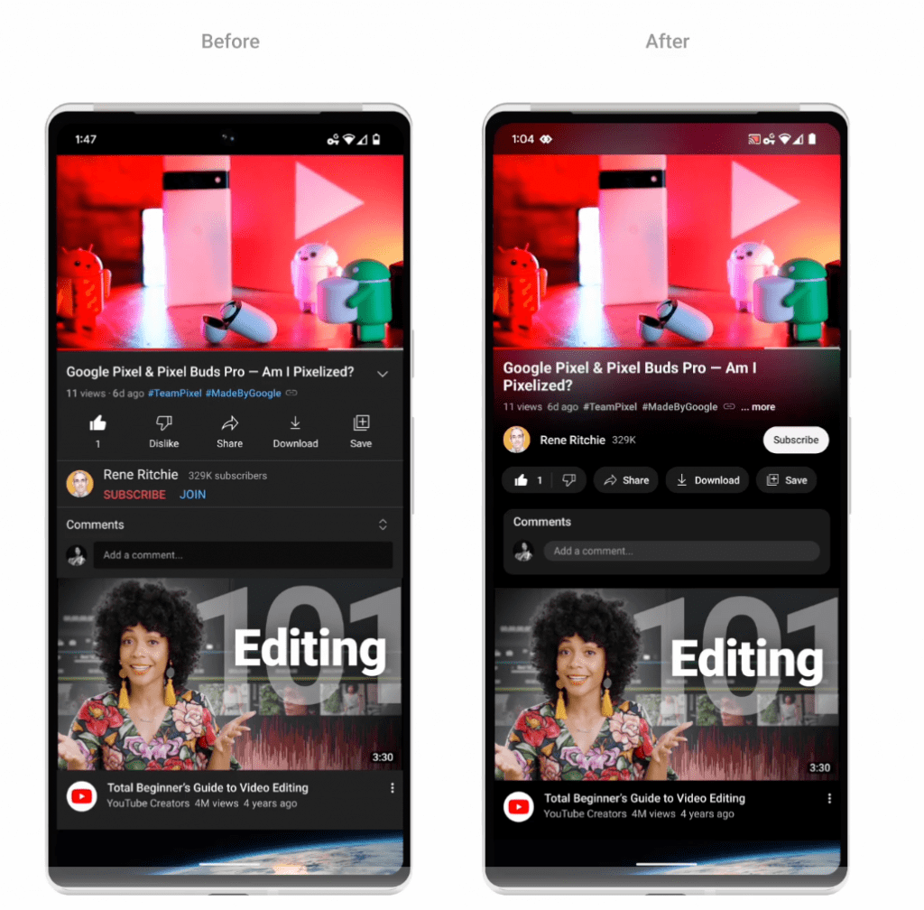
YouTube’s designers not only changed how it feels to watch a video, but they also changed the order of information on the screen. Notably, the name of the video’s creator has been moved up on the page and is now anchored below the video. The subscribe button is now right next to the name. Look at how the bright colors on that subscribe button make it almost jump off the page and make you want to tap it.
The thumbs-up and thumbs-down buttons, on the other hand, were hidden in a row below. Their low contrast makes them blend into the background.
Inside the app, all of the square buttons and thumbnails have been given rounded corners. Yes, that rounding isn’t too flashy, but YouTube’s designers say that people liked things that weren’t too obvious. One popular idea, called “Blobtoob” inside the company, took roundness to the extreme with bubble-like thumbnails and dropdown menus. The vision as a whole was clean and airy, and I’d say it was the kind of modern app experience you’d expect from a cool salad chain.
“At first, we thought, ‘That looks good, let’s look into it,'” Koechley says. “We tried it out and found that we were wrong.”
The many extras that YouTube added to the interface were talked about more. You can now scrub by keeping your thumb on the bottom bar instead of bringing up a bunch of other controls. And for longer videos, where precise scrubbing is impossible because the slightest touch of your finger can move the video forward by minutes instead of seconds, the company made a new “filmstrip view” that lets you choose your landing spot with frame accuracy.
Yet, the most useful change might be that you can now pinch to zoom in on a video to see more details as you watch. I think this will be useful for both cake-decorating tutorials and bike repair guides.