What would you sketch if you were asked to recreate the Pepsi logo from memory? Perhaps the brand’s signature red, white, and blue stripes could be arranged in a circle. Almost certainly a globe with the word “Pepsi” on it.
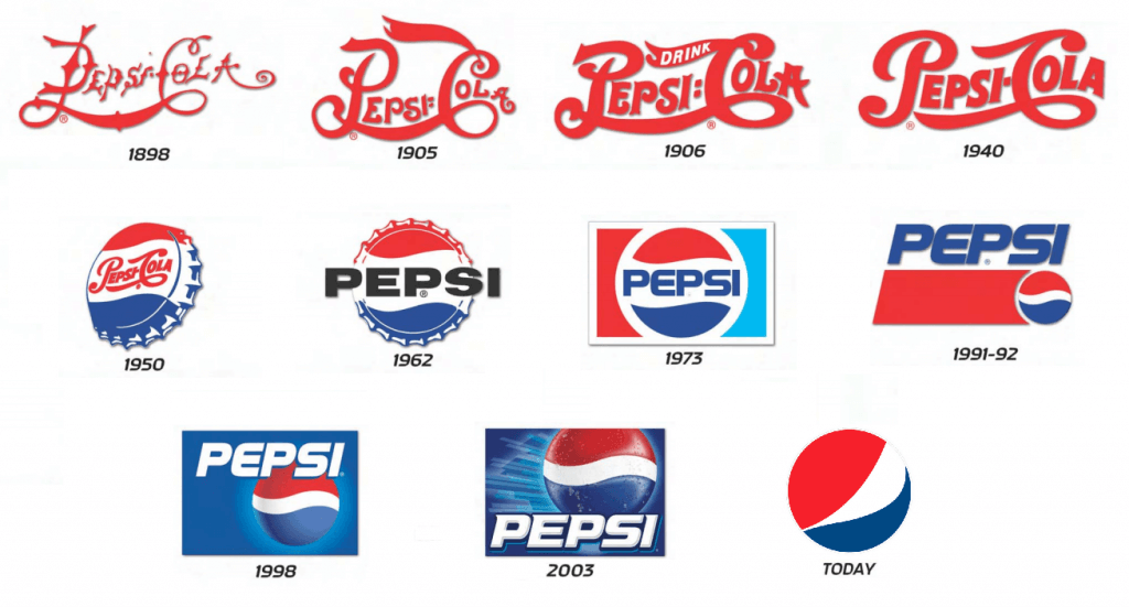
Most people put the word “Pepsi” in the circle when PepsiCo guides them through this activity, as it does on occasion. However, the current logo does not look like that at all. The brand name is subdued next to the bold globe and placed off to the side. This means a new direction for Pepsi.


PepsiCo’s chief design officer, Mauro Porcini, told CNN, “We couldn’t ignore that kind of insight.” We decided to accept it rather than reject it.
On Tuesday, Pepsi introduced its new logo and branding, which will debut in North America this fall and around the world in 2019. It has a familiar look, like the one from the 1990s that has stuck in people’s minds, but with some updated touches like a different font, font color, and border. These alterations are an integral part of Pepsi’s expansion strategy, and they’re meant to do more than just bring the brand into line with consumers’ memories.
‘Bold and confident
After 125 years in business, Pepsi occasionally revamps its logo. The current logo and branding were both unveiled in 2008. However, it’s lost some of its freshness in the years since it was first published.
“Pepsi” in the logo “is decoupled from the globe,” as Pepsi’s chief marketing officer, Todd Kaplan, put it. It’s a lowercase, italicized font; the blue is a little muted; overall, it doesn’t convey the brand’s intended sense of assurance and vitality.
Kaplan described Pepsi as “a bold and confident brand” that stands for “unapologetic enjoyment,” yet the current logo, with its lower-case “Pepsi” standing shyly away from that chillaxed globe, doesn’t seem to reflect that. Neither brave nor self-assured.
The new logo, with the bold uppercase “PEPSI” in the center of the circle and the brand name written across the white stripe that undulates between the red and blue waves, is a much better representation of the company’s identity.
Professor of marketing at Northwestern University’s Kellogg School of Management Tim Calkins observed that it is not uncommon for businesses to update their appearance to remain competitive. However, they need to tread carefully so as not to upset customers by making too many changes at once. As evidence, he mentioned the Tropicana logo controversy. Consumers of Tropicana were outraged by a 2009 redesign of the company’s beverage cartons. A short time after PepsiCo acquired Tropicana, the company reverted to its previous branding.
Calkins argued that “you always can look backward” for established brands. He emphasized the importance of making sure the legacy branding still feels modern, even though tapping nostalgic images can be “very powerful.”
Pepsi believes that the updates it is implementing will do the trick by drawing attention to contemporary features like the brand’s sugar-free options.
Zero’s the hero
Consumer interest in full-sugar soda has waned in recent years, so PepsiCo, like many other soft drink companies, has been focusing on zero-sugar products and branding.
PepsiCo (PEP) CEO Ramon Laguarta stated in a February analyst call that Zero “is going to be the center of the strategy for the Pepsi brand” in the United States. This year, Pepsi aired a Super Bowl commercial advertising its new zero-sugar recipe, which it revealed earlier in the year.
We anticipate rapid expansion of the non-sugar cola market in the United States. As Laguarta pointed out, zero was already considered a “strategic” product in Europe and other regions, and now consumers there are “pivoting.”
Therefore, “zero sugar is going to be the protagonist of our communication strategy,” Porcini told CNN.
In a nod to the all-black packaging and label of Pepsi Zero, the new logo features a black font and border to draw attention to the zero line.
The pulse campaign, which features lines radiating out of the pulsing logo in time with upbeat music in video ads and elsewhere, has a clear focal point thanks to the border.
The team took extra precautions with the update because even minor changes can cause a stir among customers.
The last few years have been “an iterative process,” Kaplan said. We think it’s a fantastic way to keep Pepsi recognizable… while looking ahead.


